|
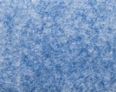
Autumn is definitely here. Though given the weather recently, there’s a strong chance that we’ve skipped that season and jumped straight to winter. This change though has given us the chance to add three new colours to our Whisper range; Sebring, Estoril and Croft. These three options expand what we’re able to offer workspace designers and can be used with immediate effect. Sebring
Sebring is a mottled blue option that combines a calming yet dynamic shade of nautical blue with the sharpness of a bold and brilliant white. From internal and external discussions, it’s clear that this is the latest stage in blue’s transformation from a staple primary colour and into a really energetic hue. We expect this colour to be really popular with designers and that’s because it was you who chose it! You might remember that during Clerkenwell Design Week we polled the great and the good of the design world as to what colours they’d like to see introduced to our Whisper range and it was this colour that came out on top. We can’t wait to see how you’ll use it. Estoril
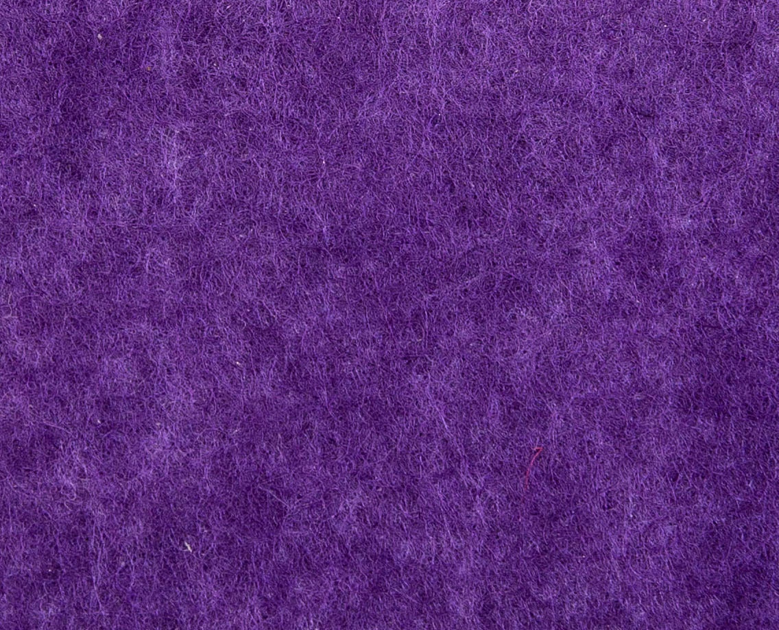
Once upon a time, purple dyes were made by a rather gory process involving snails – the less said about that the better. Thankfully, things have changed, and we can safely say that no snails are harmed in the process of creating our luxurious Estoril shade. Purple has long-held associations with mystery, imagination and creativity (so it’s no surprise that Prince picked it), which makes it an excellent colour to use within office design schemes. It also sits comfortably between the reds and the blues, making it an attractive option for people who want to use a bold colour yet not make the space too aggressive or too passive. |
Croft
Our new Croft shade is wonderfully malleable and capable of fulfilling a variety of roles within design schemes. Thanks to Croft’s mottled effect, it can be used in singularity to create an impressive series of rafts or baffles. The addition of the white to the grey creates a really vibrant visual and helps avoid creating an installation that could, potentially, look a little dark and dreary. However, that same mottled effect really opens it up for use alongside darker shades, such as red, blue and black, as it adds a little bit of lightness and helps ‘pop’ other, bolder colours. And don’t forget about the existing range of colours either, as we have something for everyone within our collection. The red of Monza, the vibrant orange of Interlagos and the different shades of grey (though we’re nowhere near fifty, thankfully) all remain incredibly popular. Yet next year, we’re expecting to see designers incorporate our Bathurst yellow more than ever, and we’ll have the fashion industry to thank for that. Yellow has really been a strong feature of clothing lines recently and we believe that the colour will truly cross over into the mainstream in 2020. The deeper, more grounded hue of Bathurst reflects the current appeal of using more natural, earthy tones, and we expect to see designers make great use of this versatile colour in the coming year.
|