|
If you’re anything like the team here at Creatif, you’ve got the OfficeLovin’ website bookmarked on you browser and can’t resist seeing the latest and greatest offices featured across their social channels. With that in mind, here are some of Creatif's staff top picks…
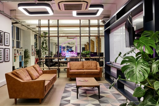
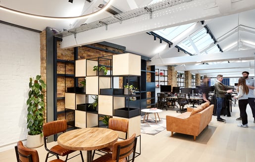
Timi Odeyemi, Project Consultant – Hutch Games by AIS “Picking just one is hard, but the most recent favourite I have seen is Hutch Games in London. The soft colours and the ample natural light give everything an airy feel. The presence of biophilia and beautiful natural wood finishes really helps to bring the outside in, and that’s something that really appeals to me personally.”
“I really like the rustic-style approach taken with the furniture too – the grid-style modular shelving, exposed elements such as steel beams and brickwork all look fantastic, especially alongside the tan leather sofa and chairs.”
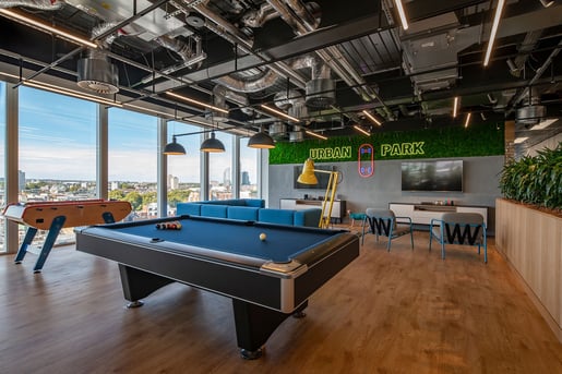
Darren Bradley, Financial Controller – Trade Desk by Peldon Rose “Even the Accounts Department like to have fun, and that’s what caught my eye with Trade Desk’s new London offices - they look like a lot of fun. Peldon Rose look to have done a great job in creating something that looks formal but not starchy.”
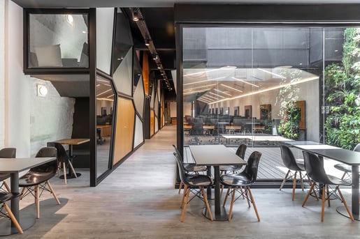
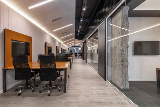
“The whole space looks relaxed with the amount of light that comes in through those nice big windows. The natural wood finishes and various biophilic elements look great too. And the terrace speaks for itself. What an awesome view!” Emma Hartley, Executive Assistant – Ualá by Hitzig Militello Architects “The first thing that stood out to me about Ualá’s offices is the use of different textures and materials. I really like the contrast between the exposed concrete pillars and brick walls against the sleek new black metal and wood seen throughout.”
“The whole space looks fun without looking distracting. I love the different shapes created and colours used on the partition to create privacy between the open plan and meeting areas.”
“The windows and small terrace really give you a sense of being outside, which is always welcomed and works really nicely here.” |
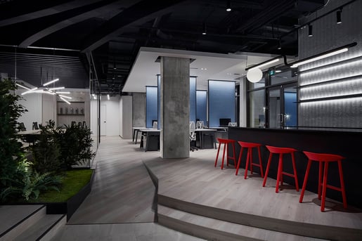
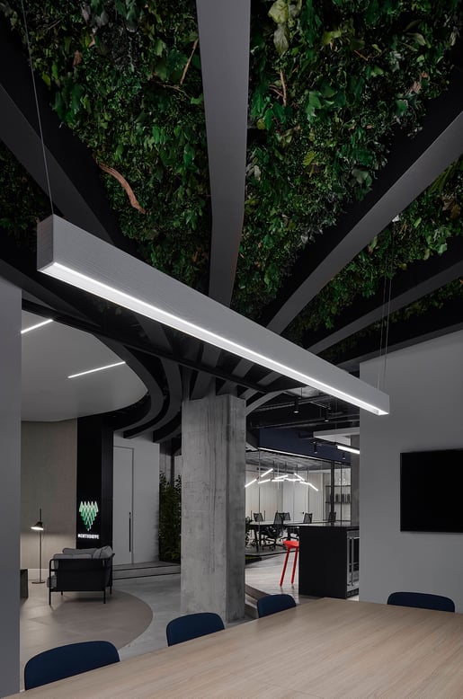
Ben Speight, Head of Marketing – North Drive by Reflect Architecture “The two things I first noticed about North Drive’s new Toronto office were it’s simplicity and it’s use of biophilia – both of which are excellent. The plants and foliage not only look great, but they’ve been incorporated into the design brilliantly to utilise space, rather than retrospectively adding potted plants.”
“I love the mix of textures; the smooth black and white surface look amazing with the more industrial-looking exposed concrete and corrugated steel. It all works really well - nothing looks distracting here and everything seems just fit.”
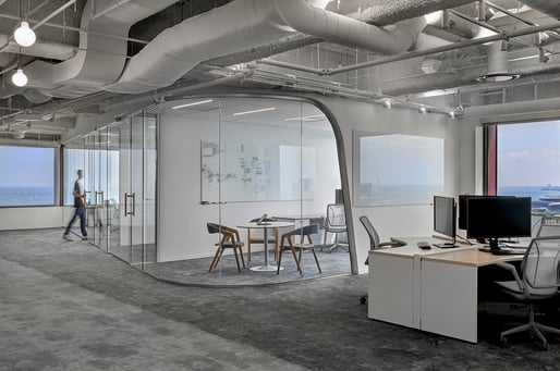
“One thing that really stands out to me is the different working areas, which I think are so important. There are clear, defined zones for collaborative working and meetings, solo tasks and a nice breakout space.” Aaron Surtees, Project Consultant – Akuna Capital by Earles Architects & Associates “This space really appeals to me and there is so much to like about it. I love the bright, airy corridor spaces and the long glass conference room.”
“The breakout space looks like a quality living room – in fact the whole space just looks like a home rather than an office. The domestic looking furniture really fits, and the hanging chairs are one of my favourites here. And of course, that view is stunning!”
“The colour scheme in the open plan office space looks very relaxing which is really important. I certainly wouldn’t mind working there, but the commute to Chicago is a bit much.” To see all of the workspaces featured in this article, please visit; OfficeLovin' |
