|
Last week, Chris flew out to Sweden to visit the annual Stockholm Furniture Fair and check out the latest trends, innovations and see where the industry is heading in the next few years. After two days traipsing around Stockholmsmässan’s three exhibition halls and some 80,000 steps later, here are his four key takeaways from the world’s premier event for promoting Scandinavian design.
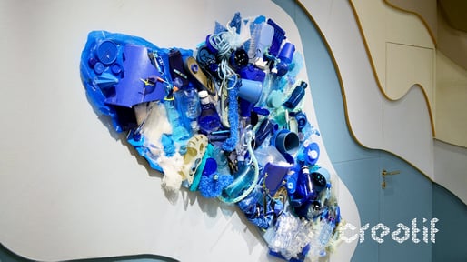
1. Sustainability is now the standardIt’s no surprise that one of – if not the – key driver was sustainability. There’s been plenty said on the topic before and many of the exhibitors weren’t necessarily saying anything new. In some instances, that might be a bad thing. But not here. Being environmentally-friendly is now a given. Cultural zeitgeists such as Blue Planet and Greta Thunberg’s Fridays for Future movement have helped push the issue into the mainstream and the design industries are following suit. Sustainable and ethical fabrics, products and workplace solutions are now – and rightly so – a given. Recently, there’s been a drop off in the use of synthetic and man-made materials in favour of more low carbon and reusable textiles such as organic cotton, recycled wood and re-purposed plastics. In Stockholm, nearly every textile company showcased its green credentials. Camira made a big splash with the promotion of their soon-to-be-launched Oceanic fabric, which a reflection of the company’s ongoing commitment to environmental product stewardship.
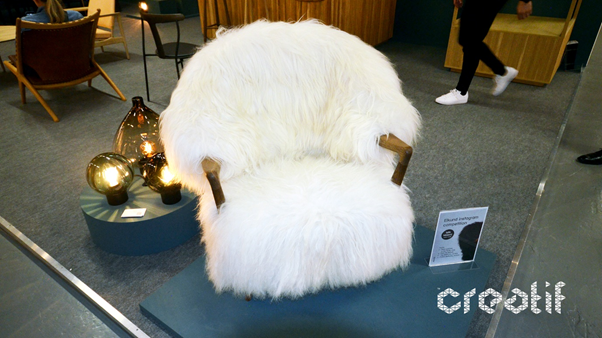
With the catchy (and clever) taglines of ‘Seasick of Plastic’ and ‘From waste to weave’, and a nautical-themed stand, they generated a big buzz and made their mark on the event. 2. Fluffy FurnitureThere was a distinct contrast between the furniture that was on offer. Many chairs and tables were traditionally Scandanavian in design with an emphasis on natural woods, pastel and neutral colour palates, that sort of thing. Yet tucked away and making a big impression was the inclusion of some furniture items that were big, bold and fluffy. Let me tell you, borg most definitely wasn’t boring.
It was great to see these playful and comfortable (yes, I road-tested a few on my many rounds of the exhibition) generate a little buzz. Yes, they might not be for everyone but there’s a strong chance we’ll be seeing more and more of these shagpile style sofas and chairs pop up as playful furniture options in some the more relaxed social and reading areas. |
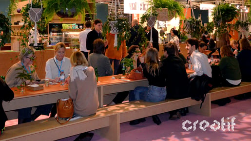
3. A Culture of CollaborationNothing works in isolation, be it a product, person or idea. And that was true of Stockholm Furniture Fair. Collaboration was rife. From product partnerships and joint promotions, through to the creation of large-scale town hall spaces, everybody was partnering up with everyone else.
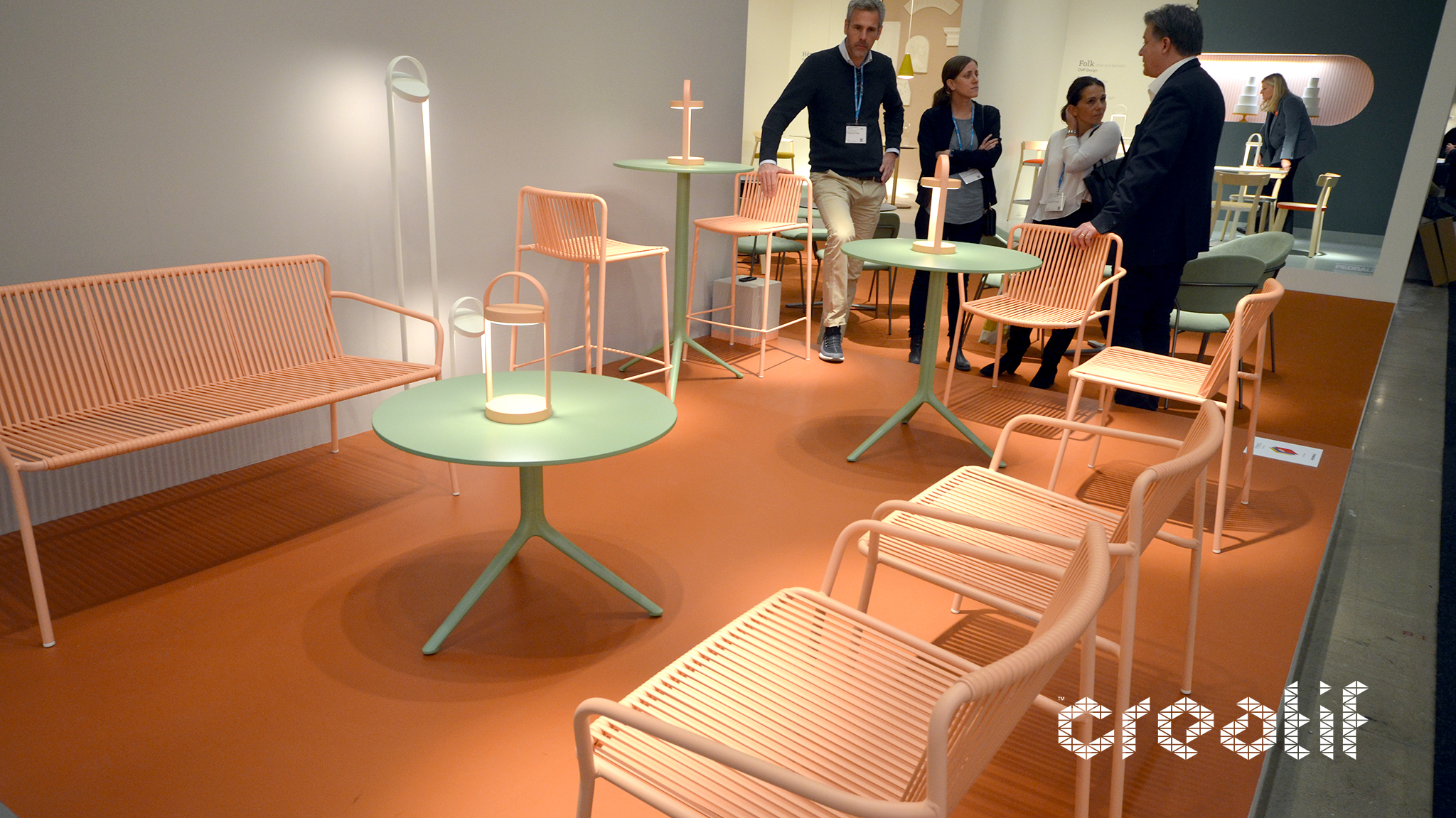
Stockholm Design Week has a great history of joint exhibitions and product showcases, and these design-led partnerships attracted attention from passers-by. This created a great social vibe to the event, which was only enhanced by the inclusion of numerous social zones laid on by the exhibitors and organisers alike. Nearly everywhere you looked people were taking the opportunity to sit down and engage with products in a natural environment, network and hold meetings. People came and went as they pleased and, from a workspace design perspective, it reinforced the need for these co-working or cross-pollination spheres within the office. 4. More Muted ColoursThe colour choices were very on trend, which, as you’d imagine, was a good thing. There was a clear emphasis on more natural, muted and pastel colours, with these being punctuated by splashes of primary shades and abstract patterns.
This almost uniform approach – there were some rather obvious exceptions – really hit home the notion that the workplace is growing up. Colour schemes and various gimmick options are being toned down and replaced with something a little more formal. There are many reasons for this change, with a maturing workforce and the shifting dynamic of employment being perhaps the two most critical. But there are other factors at play as well. There’s no denying that the concept of the office has radically changed in the past five years, simultaneously bringing about a massive shift in culture too. The use of more muted, homely colours reflects this, and reinforces the idea that our workplace really is our home from home.
|


